Posts

Showing posts from 2018

Graphic Design Performance

Image
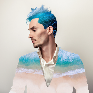
     Over the last semester, we have completed so many projects and learned a lot. From Nature Man to Infographics, we learned of diverse techniques, styles, and programs. As a review and reflection, it's always good to look back on your work and try to improve. I'm going to revisit a few of my favorites. Past Projects Nature Man      Nature Man was one of the first projects we did, aside from practice lessons. We were tasked with taking a profile picture of a man and editing it to a theme of our choosing. We worked on it for about a week or two, taking our time but also multitasking with other things. It was definitely hard starting out with only rusty knowledge from the previous year and the small lessons we had to complete, but still it remains one of my favorites. One of the hardest parts with this one in particular was the hair. Detailing every last strand to be live the waves was hard and taxing. Still, it payed off in the end by creating almost a misty aura around

Panorama

Image
     The panorama was definitely a challenge. Blending nine photos not only into each other, but to fill the entire canvas. My theme was Golden Hour, or sunrise. Every morning since I started attending high school, I ride my bus while the world wakes up. It varies depending on the time of year, but there is a good portion of time where I get to witness the sunrise for almost my entire bus ride. The Experience      At first, it was strange and foreign to me. I had always lived right next to my schools so getting up at six in the morning was a new experience. Then (especially in winter) it would still be very dark when I left the house for my stop. In early fall/late spring, the sky starts to brighten at this time. For majority of the year, the sun rises at some point along my 45-minute ride. Sometimes, it stays dark for a long time and everything feels quiet and calm.      The particular day I took the images, I was blessed with the fact that the sunrise lasted the entire ride.

Video Reflection

     In Video Production for the past few weeks, we have been hard at work finishing up our Sophomore Edition of ONW NOW (our schools weekly 10 minute news show). Even before that, we have done videos such as a feature story on a classmate, and then one on something of our choosing. Overall, while some things were a challenge, it was mostly enjoyable. I got to interview many interesting people, talk about cool stories, and work with fun people.      I learned a lot and I am starting to get more comfortable working with the equipment and interviewing people. Adobe Premiere Pro is getting easier to use and I'm learning all sorts of tips and tricks. I probably could have done better on some things, but that's all in the process of learning. Improvements      I could probably improve in areas such as my editing, speed, and productivity. It's always the little things that trip me up in editing, tiny little mistakes here and there. I just need practice to get better, and to

Watercolor Transfer Printing Process

Image
     On the side we began applying the printing processes to a small project: watercolor transfer. We printed off a picture of a recent project of our choice, either in color or black & white. We also used water colors to paint a small sheet of thick paper with any design we desired. We coated the paper (once it dried) with mod podge, a white glue-like substance that dries clear. Applying the print to the mod podge, we used a squeegee to flatten out any bubbles. Once that dried, we used water to gently rub off the paper until we could clearly see the image. The Step-by-Step      In case you are interested in doing this, here is a more in-depth look at what we did. Print off the picture of your choosing backwards (reflected across y-axis). You can also do multiple in case some don't turn out well or you have trouble deciding. Use a paint-friendly piece of paper with a sizable margin around where the print will go. You don't want it to reach the edges. You can paint

Printing Processes

Image
     We reviewed three different ways of printing: ink relief, intaglio, and lithography. They each share characteristics but have many different requirements, steps, and even tools. With different applications, resources, and finished products, each one is important. Ink Relief      Forms of ink relief was first used before the press was invented, so it could all be done by hand. With wood cut, the grain is important for the impressions it leaves in the black areas, while with the linoleum cut the black area is full and unbroken. In both cases, a previously drawn image can be traced or the image can be directly drawn onto the surface. Similar carving tools are used to define the white areas of the image, while places left alone are the black areas. Most styles are either white marks in a black area or small black streaks left in a white area. Many pictures use both is tandem. Once the image is complete, the object is treated properly then ink is applied. A slightly damp piece of p

Pop Art

Image
     One of the more recent tasks we tried was emulating pop art. We looked at many pop art pictures first, several distinct creators, and their personal styles. Afterwards we partnered up and took pictures of each other, using them for the pop art. Creating pop art digitally was definitely a challenge for me. How Did I Go About It?      I wanted a very vibrant theme but I generally stuck to cool colors in the beginning. I tinkered a lot with the specific colors themselves but it was difficult to get a coherent product I liked. I was very meticulous in where the colors went and how they bound to the edges. The shapes in the background were a lot more fun to create than spending forever adjusting and fixing the overlays. What Was My Style?      I quite liked the comic book-esc appearance of Roy Lichtenstein but had difficulty recreating the black outlines and edges. I settled for something a little closer to Andy Warhol's style of giving everything eccentric colors. I liked

Back to the Basics

Image
     One of the things we had to do before we got too deep into any projects was review the basics and also new tools we were not familiar with. This included the Patch Tool, the Clone and Stamp Tools, the Healing Brush, and Content Aware Fill. Once we reviewed these thing we practiced applying them with little photos and a collage. What Did I Do?      I completed each practice image with the help of the tutorial and familiarized myself with the tool in question. Some were very similar. Content Aware Fill would use an algorithm to determine what should logically be in the gap selected. This is handy when you need to clean up something in an image like a wall backdrop with lots of dirty spots.      Cloning was manual for situations that the computer could not determine what looks right (which is often). Cloning is essentially as the name suggests, where you select a model area and stamp it into other places.      The Patch Tool would make the selected area look more like whereve

Nature Man

Image
Collage Challenge      In e-Comm, we recently embarked on our first challenge of the year. We were given a base photo of a man, and tasked with making a collage out of it. We were given creative freedom with what we could do and what pictures we could use. What Did I Do?      At first, I was not sure where to begin. I personally am drawn to the ocean, so I figured I would do aquatic themes. I found non-copyrighted photos of beaches and waves and chose which ones I liked. From there, I decided to make the man's jacket into a beach and his hair into the waves. It was interesting getting everything to fit. How Did I Do It?      I started with the jacket, as that was a much easier thing to do. Using a clipping mask, I made the beach into the jacket with the ebbing waves just beneath his shoulders. Manipulating the light curves, I got both the jacket and the background to reasonable colors.      Next, I tackled his hair. His hair was definitely tricky because it was wispy a

e9 Final Exam

Image
     This quarter, we began on a big project that would last us until finals. We were put in teams of four and tasked with coming up with a product that does not exist, then to market it every way we have worked with in the past. Logos, websites, ads, coupons, commercials, you name it. It was sort of challenging coming up with everything, but we were led through rotations that helped a lot.      One challenge was the commercial, as the effects needed were really hard to get ahold of and perfect. The lightning bolt in the commercial had to be meticulously animated. We weren't given a whole lot of feedback until everything was practically finished and all the groups were getting ready to present their products. About half way through, we figured out a really cool slogan and started using it in more places. I am really proud of what my group created, and I feel we were tough competition, especially since another group in a different hour had an almost identical product to ours.  

CSS and CARP Design

Image
     We are finishing a short project in Dreamweaver on CSS and CARP. We were giving a basic, poorly designed webpage and tasked with making it better without changing any of the actual content. Formatting, color, fonts, and overall style was moved around to produce a much better looking outcome.      The new design uses Contrast with its color mostly. The main area is a pasty white while the background is black. The first paragraph of the poem is in a different font, and the title is much larger than the rest of the text.      The new design uses Alignment by keeping all the paragraphs on the same invisible line. The title and subtitle are both center-aligned. The text at the very top is also aligned with the poem.      The new design also uses Repetition by using the same colors and fonts multiple times. Georgia is used for the two titles while most of the poem is all the same font. The tans, pasty white, and black is all from the dog's fur colors.      Lastly, the n

My Personality Type

Image
     We recently took the personality type test, and I scored as an ESFP. ESFPs are typically out-going, friendly, social, fun-lovers who love to experience the world around them. Many famous ESFPs are performers or people who love being on stage. People with this type range from Marilyn Monroe and Michelangelo to Bill Clinton and Katy Perry.      I think my personality type describes me fairly well, as I love hanging out with friends and doing fun activities. I also love performing on stage and being nice to those around me. However, I am not super social, as I am not fond of large crowds or many people I don't know. I am also not caught up on the latest fashion trends.      I still love to make people happy and I especially enjoy certain smells and textures of the world around me. I am not fond of stress or obnoxious work, and have a tendency to procrastinate, but I love being with fun people.     After taking this test, we took another one: the LOBG test. It stands for

Logo Design

Image
     Our most recent project was on logo design. Logos are iconic parts of our everyday life, and they symbolize a company or a product. We were tasked with creating our own logo designs.      First, we drew everything out on paper, making as many ideas as we could. Ultimately, we took the best 3 or so, and took them to Illustrator. From there, we began expirementing. My first design was a palm tree in a circle. I wasn't sure what I wanted to do at first, so I tried aquatic themes. I added extra circles and an island, as well as some negative space, and quite liked how it turned out.  My second design was a shooting star with letters in the stream. I tried both my first name, and my initials. I also used different thicknesses for the lines. As much as I like the concept, it didn't turn out as I had quite hoped. My third design was my initials selecting over the water. I tried multiple methods for the fade, but nothing quite worked. I also tried putting a (blacked-out) su

Color Wheels

Image
What was the project about? The color wheel is a classic that goes hand in hand with the types of color schemes, and important part of graphic design. We were tasked with creating a generic color wheel, including the primary, secondary, and tertiary colors. We were supposed to label them all in tie the primary and secondary colors together. Once that was completed, we came up with a strange colors wheel with an irregular design of our choosing. What did I learn? I learned how to tie colors and shapes together in effective designs. A side note, when talking about tertiary colors, the ones between primary and secondary, you always list the primary color part of the name first. It also helped us get used to using Adobe Illustrator, particularly the shapes tool. What did I do? For the basic color wheel, I used circles for primary colors, squares for secondary, and triangles for tertiary. I tried experimenting with transparency, but with so many overlapping colors, it got reall

C.A.R.P.

Image
     This time in class, we took the base material for a Wizard of Oz Poster and completely reconstructed using CARP. CARP stands for Contrast, Alignment, Repetition, and Proximity. Contrast      Contrast applies to fonts, colors, sizes, and anything that makes it stand out. I used contrast by not only making the more important details larger, but using different colors. There are also two different fonts, one with serifs, and one without. Alignment Alignment relates to how you organize things visually. Center alignment, while seemingly pretty, is actually really messy and leaves loose ends on both sides more often than not. The title and most of the information is all aligned on the left, while the organization and the silhouetted image are aligned to the right. Repetition Repetition is another way to organize things visually and maintain a certain level of consistency. The colors are repetitive because the yellow lettering is used twice and the dark green four times. T

Typefaces

Image
What was the project about?      In Graphic Design, we've been working with typefaces, commonly known as fonts. In this project, we took part of our name and identified 10 different parts used in the typeface, like serifs. Serifs are the little "curly things" at the end of some letters. Typefaces are very important for conveying meaning that goes beyond the words, and things like the serifs make a big difference. What did you learn?      We started by learning the basic 3 types of categories for typefaces: Formal, Casual, and Decorative. Formal is usually on invitations or professional projects, and are usually serif fonts. The letters flow together and become easier to read in large text blocks.      The second type, Casual may be used on websites and other places. They are typically sans-serif, meaning they don't use serifs. Serif and non-serif typefaces usually go well together, if used correctly.      The third type is Decorative, and can be used for adve

Logo Color Schemes

Image
Analogous This logo is analogous because of the yellow-orange color in between the yellow in the center, and the orange outline. I think the company chose these colors because orange and yellow are sometimes associated with food, and Tostitos sells chips and other things. This logo is analogous because it uses a yellow-green between the yellow and green, forming a smooth slide of color. They may have chosen to use these colors to show a calm feeling while being warm and inviting. Complementary This logo is complementary because orange and purple are complementary colors, and they are both used prominently in this logo. I believe Fanta chose this color scheme to make their product eye-popping, so it will stand out and catch your attention. This logo is complementary because red and green are complementary, and red is used in the name "Krispy Kreme" with a green border. I believe they chose this to make their logo catch your at