Logo Color Schemes
Analogous
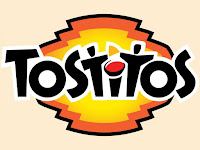
 This logo is analogous because of the yellow-orange color in between the yellow in the center, and the orange outline. I think the company chose these colors because orange and yellow are sometimes associated with food, and Tostitos sells chips and other things.
This logo is analogous because it uses a yellow-green between the yellow and green, forming a smooth slide of color. They may have chosen to use these colors to show a calm feeling while being warm and inviting.
Complementary
 This logo is complementary because orange and purple are complementary colors, and they are both used prominently in this logo. I believe Fanta chose this color scheme to make their product eye-popping, so it will stand out and catch your attention.
 This logo is complementary because red and green are complementary, and red is used in the name "Krispy Kreme" with a green border. I believe they chose this to make their logo catch your attention, but not be too overwhelming, so they decided them a little with a white center.
Cool
 This logo uses cool colors because of the multiple shades of blue, and blue is one of the three (main) cool colors. They may have used this color scheme to convey a sense of trust in their products, so people with use them.
 This logo uses cool colors because of the multiple shades of green, and green is another of the three cool colors. They may have used green because it is often associated with nature, or the wild, and Animal Planet is all about the wild.
Monochromatic
 This logo is monochromatic because it uses a gradient of blue, with mostly shades of blue that give way to a tint of blue in the center. This color scheme might have been used to show trust that their products are good, or a sense of relaxation.
 This logo is monochromatic because of the multiple shades and tints of blue and orange in the globe and the fox's fur. The shine of the globe is a tint of blue with the continents being a shade. The tints of orange are in the fox's tail, while the shades are the shadows on its back. These may have been used to show a sense of depth and detail, showing what lengths Firefox goes to give you proper information.
Triad
 This logo uses triad colors because of the red words, blue outline, and yellow center (primary colors). They may have been used to show the range of foods Burger King sells, from hamburgers to soda to pie (sometimes).
 This logo uses train colors because of the red and blue words, and the red, blue, and yellow dots behind "Wonder" (again, primary colors). They may have used these colors to catch your attention, and stay basic in color to show their products are natural.
Warm
 This logo uses warm colors because of the intertwining red and yellow circles behind "Master Card". They may have used this because it shows they are not relaxed when it comes to your protection and money, but will actively defend it against harm.


Comments
Post a Comment