Pop Art
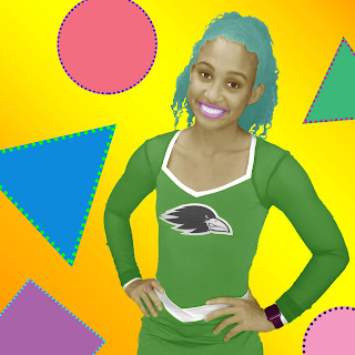
One of the more recent tasks we tried was emulating pop art. We looked at many pop art pictures first, several distinct creators, and their personal styles. Afterwards we partnered up and took pictures of each other, using them for the pop art. Creating pop art digitally was definitely a challenge for me.
How Did I Go About It?
I wanted a very vibrant theme but I generally stuck to cool colors in the beginning. I tinkered a lot with the specific colors themselves but it was difficult to get a coherent product I liked. I was very meticulous in where the colors went and how they bound to the edges. The shapes in the background were a lot more fun to create than spending forever adjusting and fixing the overlays.
What Was My Style?
I quite liked the comic book-esc appearance of Roy Lichtenstein but had difficulty recreating the black outlines and edges. I settled for something a little closer to Andy Warhol's style of giving everything eccentric colors. I liked the eye popping patterns but couldn't get colors that seemed to mix right.
How Did I Do It?
The first step was turning the image black and white. Then we had to slowly add color back in. Personally I used a lot of color balance adjustments to change the hues. I tried to use the same few colors repeatedly for several parts. Getting the "skin" color was a challenge but eventually I got something acceptable. I also used some brightness adjustments to whiten parts to make them pop. If I had to do this again, I'd add more darkness into the shadows to create contrast.
 |
| Morgan in her ONW cheerleader outfit |


Comments
Post a Comment