Graphic Design Conclusion
Favorite projects
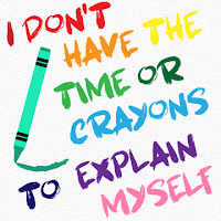
 Color Font Pairing Typography


 The typography assignment was one of the hardest projects this semester. We chose four quotes and arranged them digitally with specially picked fonts and colors (and graphics). I struggled with finding decent fonts that go together and go with my theme. I also had some difficulties choosing colors that complemented each other. However, I pulled through and learned a lot about both fonts and colors. My friend gave me some advice on what colors looked well together and what worked. My starting sketches were very basic and did not even factor in colors on most of them. In the end, I tinkered a lot with the design and got something I liked. I really liked this project because it helped me with choosing fonts, telling what colors go together, and arranging graphics/text.
 |
| Original photo |
 Vector Portrait

Not only did I get to look at my adorable cat's face all the time, but the vector portrait taught me how to use new tools and techniques. We took a portrait of our choosing (mine was of my cat Buster) and created a digital version using only vectors. We could pick between organic vectors and trigonal vectors. I chose the former as organic things appease to me more. Sometimes, a project will test my patience if I do not like it and just want it done but this one did not. It was very slow, methodical, and therapeutic. It required little brain power and lots of visuals. Through this project, I learned about the curvature tool, which is now one of my favorite tools. One thing I did not anticipate with the outcome was the green color. My cat is gray but when pulling out the colors, a lot of them turned out green due to the meddling of the image, so I just went with it. If I could change anything, I might have chosen a slightly different background color. Still, I love the outcome and it was one of my absolute favorites!

Event Advertising
One of the more recent adventures in graphic design was the event advertising. We started by choosing and researching an artist (museum or concert type). Next, we created posters, post cards, and tickets for a real or made up performance/exhibit of theirs. I chose Ruelle, a widespread but not well known singer who has her fingers in many proverbial pies. I put a lot of effort into creating a black and white vector image of her profile. Additionally, I made a microphone and a few basic music notes. This time around, I learned about how to use bleeds and copying color schemes. I really like Ruelle and the poster was my favorite outcome of this project. I quite like how they all turned out.


 My Growth

Weaknesses
For starters, I still struggle with deadlines a bit. I've definitely improved but it is still difficult. I also need second opinions on fonts and colors (sometimes a third opinion too). My creativity tends to stray to certain topics and refuse to move as well. I will lock onto an idea or visual, such as water (yeah) or flowers and just create several versions before trying anything else.
 Strengths

I can confidently say I improved this semester and this year. As year 2 of e-Comm comes to a close, I have definitely expanded my abilities. I learned how to use vectors, the curvature tool, how to better use colors and fonts, balancing images, and how to quickly use Adobe Illustrator short cuts. (On my own time, I learned how to use the live paint tool too). I am better at vector images than typography and logos over colors. I like creative freedom in what I do and tend to lean towards simple, appealing graphics rather than complicated or wordy products. I even dabbled in cover art, character design, and pattern creation on my own time.

 Conclusion


 Overall, I loved learning about vectors and all sorts of convenient tools that are not as complex or obnoxious as the paint tool. If I could change anything, it probably would be the pop art project we did first semester. I did not like not having the ability to choose my subject and I struggled a little bit with finding different ways to do it. (I also had a poor understanding of color at the time but that is unrelated.) Next year, I simply want to keep expanding my knowledge and skills in graphic design, learning how to do lots of different products and different ways to do them. I also want to challenge myself to find ways to use that knowledge outside of school. I can not wait to see what we learn next year!
Comments
Post a Comment