Pre-Production
 |
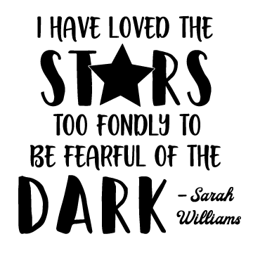
| Music B&W |
I had a fun time looking for quotes but I was also a little finicky when it came to decided what I really liked. A number of the 10 quotes I saved were star-themed, the others were miscellaneous. Once I chose the first few quotes I wanted to use I knew what feel and idea I wanted to go for but finding a font to match was difficult. After perusing for a while, I eventually found several different fonts that I liked, ranging from serif to semi-bold blocks to script. I repeated a couple fonts that I enjoyed.
Production
Creating in Illustrator was challenging, trying to arrange all the words and mix and match different fonts together. I was constantly resizing and moving words and phrases around, especially on the longer quotes. In some, I went for a centrally-aligned feel on a few quotes
while many staggered about the screen depending on the words and idea I was trying to convey.
 |
| Music w/ Color |
Throughout the process, I found the "join" features. I was not fully aware of this before and it greatly helped me. It allowed me to take separate lines and pieces, combine them so there would not be handing bits, and fill them in on one move without having to use the messy paint brush. Working in color was interesting because I sometimes struggle to find colors that work well together. I tried adding color to the "salt and sugar" quote and all I could get was changing the painted dash to red. Eventually I replaced it (and several others) with new quotes. I'm really proud of the "lonely" quote and if I went back, I would improve the "greener grass" one.
I equally liked both b&w and color. Black and white was handy for conveying the message more clearly and I did not have to worry about matching colors. Color was good when creating more visually stimulating quotes, such as the "lonely" one.
 |
| Salt + Sugar |
Final Product


Comments
Post a Comment