CSS and CARP Design

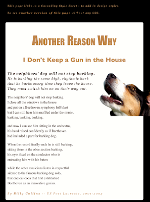
We are finishing a short project in Dreamweaver on CSS and CARP. We were giving a basic, poorly designed webpage and tasked with making it better without changing any of the actual content. Formatting, color, fonts, and overall style was moved around to produce a much better looking outcome. The new design uses Contrast with its color mostly. The main area is a pasty white while the background is black. The first paragraph of the poem is in a different font, and the title is much larger than the rest of the text. The new design uses Alignment by keeping all the paragraphs on the same invisible line. The title and subtitle are both center-aligned. The text at the very top is also aligned with the poem. The new design also uses Repetition by using the same colors and fonts multiple times. Georgia is used for the two titles while most of the poem is all the same font. The tans, pasty white, and blac...

