Posts

Showing posts from February, 2018

Color Wheels

Image
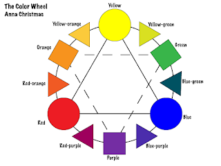
What was the project about? The color wheel is a classic that goes hand in hand with the types of color schemes, and important part of graphic design. We were tasked with creating a generic color wheel, including the primary, secondary, and tertiary colors. We were supposed to label them all in tie the primary and secondary colors together. Once that was completed, we came up with a strange colors wheel with an irregular design of our choosing. What did I learn? I learned how to tie colors and shapes together in effective designs. A side note, when talking about tertiary colors, the ones between primary and secondary, you always list the primary color part of the name first. It also helped us get used to using Adobe Illustrator, particularly the shapes tool. What did I do? For the basic color wheel, I used circles for primary colors, squares for secondary, and triangles for tertiary. I tried experimenting with transparency, but with so many overlapping colors, it got reall...

C.A.R.P.

Image
     This time in class, we took the base material for a Wizard of Oz Poster and completely reconstructed using CARP. CARP stands for Contrast, Alignment, Repetition, and Proximity. Contrast      Contrast applies to fonts, colors, sizes, and anything that makes it stand out. I used contrast by not only making the more important details larger, but using different colors. There are also two different fonts, one with serifs, and one without. Alignment Alignment relates to how you organize things visually. Center alignment, while seemingly pretty, is actually really messy and leaves loose ends on both sides more often than not. The title and most of the information is all aligned on the left, while the organization and the silhouetted image are aligned to the right. Repetition Repetition is another way to organize things visually and maintain a certain level of consistency. The colors are repetitive because the yellow lettering is used twice and...