Posts

CSS and CARP Design

Image
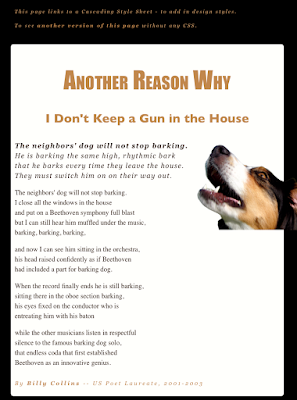
     We are finishing a short project in Dreamweaver on CSS and CARP. We were giving a basic, poorly designed webpage and tasked with making it better without changing any of the actual content. Formatting, color, fonts, and overall style was moved around to produce a much better looking outcome.      The new design uses Contrast with its color mostly. The main area is a pasty white while the background is black. The first paragraph of the poem is in a different font, and the title is much larger than the rest of the text.      The new design uses Alignment by keeping all the paragraphs on the same invisible line. The title and subtitle are both center-aligned. The text at the very top is also aligned with the poem.      The new design also uses Repetition by using the same colors and fonts multiple times. Georgia is used for the two titles while most of the poem is all the same font. The tans, pasty white, and blac...

My Personality Type

Image
     We recently took the personality type test, and I scored as an ESFP. ESFPs are typically out-going, friendly, social, fun-lovers who love to experience the world around them. Many famous ESFPs are performers or people who love being on stage. People with this type range from Marilyn Monroe and Michelangelo to Bill Clinton and Katy Perry.      I think my personality type describes me fairly well, as I love hanging out with friends and doing fun activities. I also love performing on stage and being nice to those around me. However, I am not super social, as I am not fond of large crowds or many people I don't know. I am also not caught up on the latest fashion trends.      I still love to make people happy and I especially enjoy certain smells and textures of the world around me. I am not fond of stress or obnoxious work, and have a tendency to procrastinate, but I love being with fun people.     After taking this test,...

Logo Design

Image
     Our most recent project was on logo design. Logos are iconic parts of our everyday life, and they symbolize a company or a product. We were tasked with creating our own logo designs.      First, we drew everything out on paper, making as many ideas as we could. Ultimately, we took the best 3 or so, and took them to Illustrator. From there, we began expirementing. My first design was a palm tree in a circle. I wasn't sure what I wanted to do at first, so I tried aquatic themes. I added extra circles and an island, as well as some negative space, and quite liked how it turned out.  My second design was a shooting star with letters in the stream. I tried both my first name, and my initials. I also used different thicknesses for the lines. As much as I like the concept, it didn't turn out as I had quite hoped. My third design was my initials selecting over the water. I tried multiple methods for the fade, but nothing quite worked. I also tried ...

Color Wheels

Image
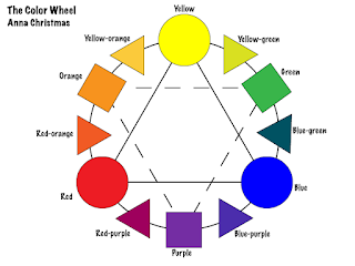
What was the project about? The color wheel is a classic that goes hand in hand with the types of color schemes, and important part of graphic design. We were tasked with creating a generic color wheel, including the primary, secondary, and tertiary colors. We were supposed to label them all in tie the primary and secondary colors together. Once that was completed, we came up with a strange colors wheel with an irregular design of our choosing. What did I learn? I learned how to tie colors and shapes together in effective designs. A side note, when talking about tertiary colors, the ones between primary and secondary, you always list the primary color part of the name first. It also helped us get used to using Adobe Illustrator, particularly the shapes tool. What did I do? For the basic color wheel, I used circles for primary colors, squares for secondary, and triangles for tertiary. I tried experimenting with transparency, but with so many overlapping colors, it got reall...

C.A.R.P.

Image
     This time in class, we took the base material for a Wizard of Oz Poster and completely reconstructed using CARP. CARP stands for Contrast, Alignment, Repetition, and Proximity. Contrast      Contrast applies to fonts, colors, sizes, and anything that makes it stand out. I used contrast by not only making the more important details larger, but using different colors. There are also two different fonts, one with serifs, and one without. Alignment Alignment relates to how you organize things visually. Center alignment, while seemingly pretty, is actually really messy and leaves loose ends on both sides more often than not. The title and most of the information is all aligned on the left, while the organization and the silhouetted image are aligned to the right. Repetition Repetition is another way to organize things visually and maintain a certain level of consistency. The colors are repetitive because the yellow lettering is used twice and...

Typefaces

Image
What was the project about?      In Graphic Design, we've been working with typefaces, commonly known as fonts. In this project, we took part of our name and identified 10 different parts used in the typeface, like serifs. Serifs are the little "curly things" at the end of some letters. Typefaces are very important for conveying meaning that goes beyond the words, and things like the serifs make a big difference. What did you learn?      We started by learning the basic 3 types of categories for typefaces: Formal, Casual, and Decorative. Formal is usually on invitations or professional projects, and are usually serif fonts. The letters flow together and become easier to read in large text blocks.      The second type, Casual may be used on websites and other places. They are typically sans-serif, meaning they don't use serifs. Serif and non-serif typefaces usually go well together, if used correctly.      The...

Logo Color Schemes

Image
Analogous This logo is analogous because of the yellow-orange color in between the yellow in the center, and the orange outline. I think the company chose these colors because orange and yellow are sometimes associated with food, and Tostitos sells chips and other things. This logo is analogous because it uses a yellow-green between the yellow and green, forming a smooth slide of color. They may have chosen to use these colors to show a calm feeling while being warm and inviting. Complementary This logo is complementary because orange and purple are complementary colors, and they are both used prominently in this logo. I believe Fanta chose this color scheme to make their product eye-popping, so it will stand out and catch your attention. This logo is complementary because red and green are complementary, and red is used in the name "Krispy Kreme" with a green border. I believe they chose this to make their logo catch your at...