Posts

Semester Reflection

Image
Graphic Design Semester Reflection      So far this year, I have worked towards completion on one of my longest projects: a subscription box. Between designing patterns and deciding composition, it's only halfway done but it's still an impressive progress. The Takeaway      Each of the five guarantees played an important role in the learning process. With technology, I had to learn to design and create digital patterns, something I was not used to nor prepared for. I made my way through by asking questions and learning from mistakes. The composition of the box was also important lest it come out wrong. We only get one try with the boxes so it mattered greatly.      I continued working on collaborating and communication too. These were important to both understand the parameters of the project as well as catch hiccups along the way. By talking with fellow students and checking in with the teacher, I made sure to get things done correctly and on time.      With this

Graphic Design Conclusion

Image
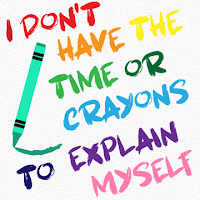
Favorite projects Color Font Pairing Typography      The typography assignment was one of the hardest projects this semester. We chose four quotes and arranged them digitally with specially picked fonts and colors (and graphics). I struggled with finding decent fonts that go together and go with my theme. I also had some difficulties choosing colors that complemented each other. However, I pulled through and learned a lot about both fonts and colors. My friend gave me some advice on what colors looked well together and what worked. My starting sketches were very basic and did not even factor in colors on most of them. In the end, I tinkered a lot with the design and got something I liked. I really liked this project because it helped me with choosing fonts, telling what colors go together, and arranging graphics/text. Original photo Vector Portrait      Not only did I get to look at my adorable cat's face all the time, but the vector portrait taught me how to use n

Short Film

Pre Production      Our final project for video production has come to a close: the feature film. Tasked with creating a 5-8 minute long feature film, my group created Bases Loaded. We started out with everything planned, all props taken care of, the storyboard (by me) was coming along nicely, things were looking alright. Then, our two main actors had to cancel. The only people left that we could use were those in our own group, whose schedules were restricted to school hours. Our director Blake Gamber took the role of Jon and our planner Michael Lovelady played Matt. We ended up changing the story around to fit our new schedule. Luckily, production went a little better. Production      Majority of our film was shot at CBAC, the activity center right next to the school. We continued to get all the film we needed despite the poor weather and high winds. We got as many shots as we could for our multiple montages and got quite stable clips considering we only had a tripod for our in

The Breakfast Club Trailer

The Breakfast Club Trailer Parody Link Pre-Production      This time, we created movie trailers from actual trailers that existed. My group settled on the classic The Breakfast Club. (I had never watched it and had to go do that.) Before we started filming, we had to find our actors, divvy up roles, and dissect the trailer. I was the editor, Andrew Duwe was the director, and Blake Dane was our cinamatographer (and one of the actors). I made our shot sequence, which was the length of a clip, where it was, what happened in it, and what audio there was, for every different shot. Andrew and Blake divided up the story board (drawing pictures of each shot) 1:2. Lastly, Andrew was in charge of getting all of our actors. We even got our principal to be the principal in the video. Production      We did just about all of our filming in two days. After school Monday we filmed as many shots as possible with two of our actors, as Blake never showed up and did not respond to our attempts

Vector Portrait

Image
Pre-production      The vector portrait has definitely been one of my favorite projects. The beginning was a little hard choosing what picture to use. It had to be a high resolution portrait of a person or animal. I ended up picking one of my favorite pictures of one of my cats: Buster. Unlike a lot of human portraits, the color-simplification in Photoshop was tough. Buster has a lot of detail in his fur so the program was unable to do a lot. It greatly simplified the background though, which helped me tune it out while working. Production      It is best to start on the eyes and nose in most portraits since they are often very detailed. The process of creating vectors and shapes around his eye was actually hypnotic and therapeutic. I ran into a little trouble with one of his eyes as he has some fog that harshly reflected the light. (Buster's not very old and we doubt it's a cataract but he has lost vision in that eye.) I improvised with some of the pattern and referenced

High Hopes Music Video

Image
Panic! At the Disco - High Hopes Music Video Link Overview      The project we have been working on in Video Production was a music video. We had to pick a song that already exists and record and edit our own music video for it (using the original audio). My group chose High Hopes by Panic! At the Disco. Along the way we had to make a storyboard, a timeline, and a cast/location list. The Process      We had to record a ton of different scenes all over, including locations that we had to have a teacher come with us. We got the opportunity to work with brand new cameras on this project too. Unfortunately that made white balancing difficult and even the teacher had trouble so some of out shots came out blue and had to be adjusted in editing. Eventually we did get it working and still got some pretty good shots.      In editing, I laid all the clips in Premiere Pro (after clipping them and deleting the mistakes) and ordered them. I adjusted them to somewhat go

Typography: B&W and Color

Image
Pre-Production Music B&W      I had a fun time looking for quotes but I was also a little finicky when it came to decided what I really liked. A number of the 10 quotes I saved were star-themed, the others were miscellaneous. Once I chose the first few quotes I wanted to use I knew what feel and idea I wanted to go for but finding a font to match was difficult. After perusing for a while, I eventually found several different fonts that I liked, ranging from serif to semi-bold blocks to script. I repeated a couple fonts that I enjoyed. Production      Creating in Illustrator was challenging, trying to arrange all the words and mix and match different fonts together. I was constantly resizing and moving words and phrases around, especially on the longer quotes. In some, I went for a centrally-aligned feel on a few quotes while many staggered about the screen depending on the words and idea I was trying to convey.  Music w/ Color      Throughout the process, I found